
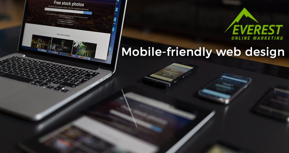
Keeping in mind the overall functionality and accessibility without having to compromise the web design is essential in the digital age. As cliche, as it may sound, keeping your web design simple, will allow more users to engage to your website. However, with the advancement of technology in this day and age, more and more people are making use of their mobile devices to surf the web. This is why making your website mobile-friendly is essential in increasing online engagement. Unfortunately, the common use of long-scrolling in websites is not something a lot of mobile users appreciate.
Here are some ways on how you can make long-scrolling in web design up par to mobile users liking
1. Make it simple
Making a simpler version of your website for mobile devices is a step ahead in ensuring its accessibility. Mobile devices have limited spaces and removing parts for the mobile version from its original web design will allow mobile users to scroll through your website easier.
2. Make call to action (CTA) visible
Mobile users’ first impression of your website is crucial in deciding whether they will continue scrolling or not. It’s important to provide all the necessary information and CTAs from the moment they open your website. However, putting too much of anything can be overwhelming to users. Make sure that users won’t see much irrelevant CTAs on their first scroll.
3. Avoid complicated Scrolling
Having a decorative website with fancy scrolling might get mobile user’ attention but it can also slow down the loading of your website–especially on mobile devices. This can be annoying for users, thus, should be avoided.
4. Consider popular mobile devices’ standard sizing in modeling your website
There are no actual rules to follow in making your website mobile-friendly. It is, however, important to take note of the pattern by which your visitors browse your website. One good way to make your website accessible to mobile devices is by making it at best, three to five scrolls.
Another thing you can consider is the standard sizes used by popular mobile devices. For example, you can try including new models of iPhone and Samsung when considering the size appropriate to your website. The use of other Android devices can be a bit tricky since there are many brands to consider. You can try looking into the most popular smartphones available in the market. This will give you an idea of how you can make your website be more accessible to mobile devices users.
Outsourcing your web and graphic design to Everest Online Marketing is a cost-effective way to improve your website. Inquire now.


Leave A Comment
You must be logged in to post a comment.