In the high-stakes world of real estate, your website is more than simply a digital storefront; it’s the tipping point that may either convert interested visitors into loyal consumers or drive them right to your competitors. Did you know that 75% of consumers evaluate a company’s legitimacy depending on its website design? If your real estate website design isn’t up to pace, you may be losing out on leads, conversions, and money.
Hence, we’re sharing 10 hacks for improving your real estate website design and leaving a lasting impression.
The Importance of Effective Real Estate Website Design
An effective real estate website design does more than just look beautiful; it fosters trust, increases engagement, and eventually transforms visitors into customers. In this highly competitive industry of real estate, the value of a great website design cannot be understated.
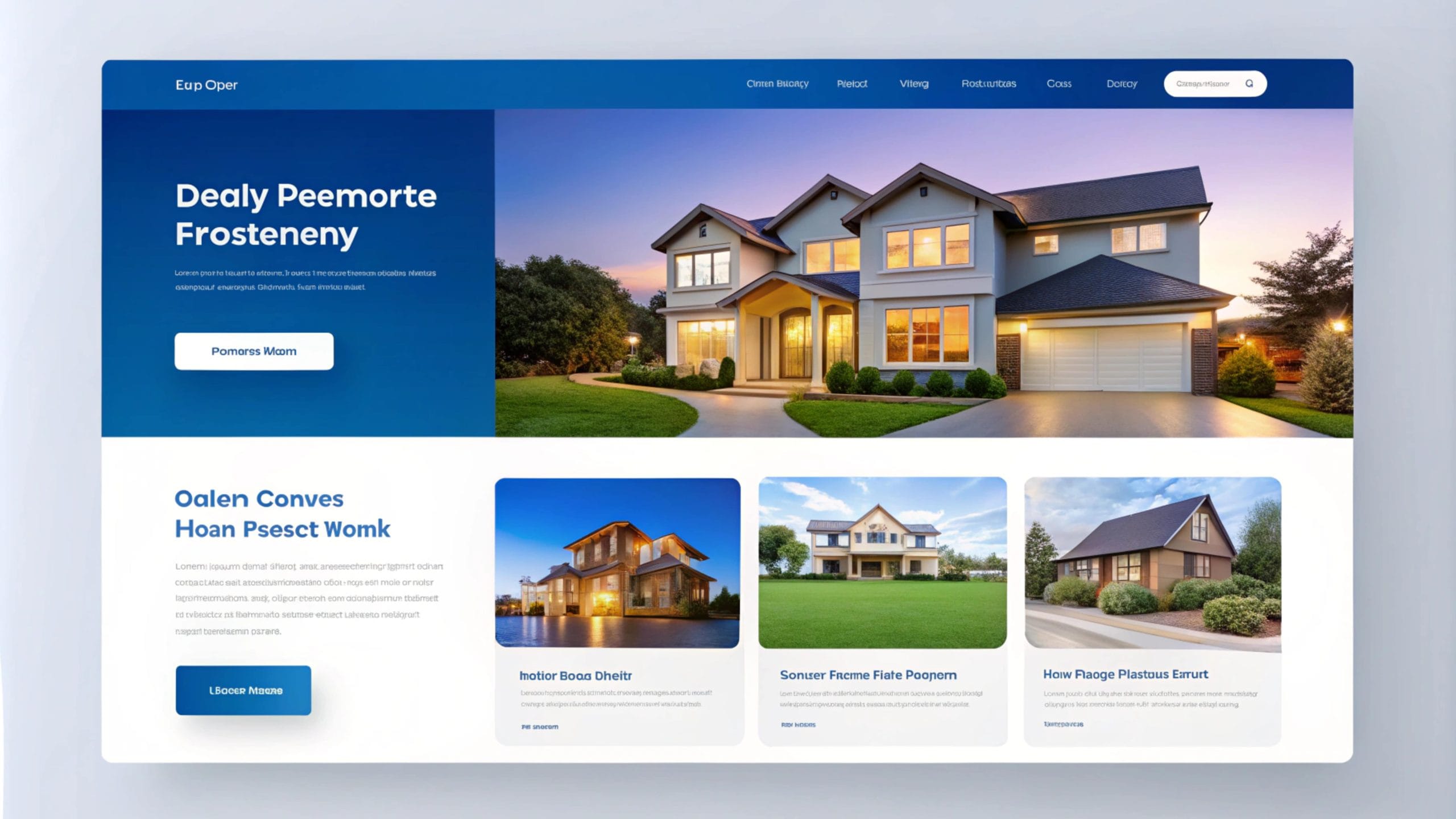
The Power of User Experience
Your website often serves as the initial point of interaction between you and potential clients. A seamless, intuitive design improves the user experience by keeping visitors engaged and making it easier to browse properties. Real estate website design that stresses user-friendly interfaces not only increases customer satisfaction but also keeps them on your site for longer.
Boost Conversion Rates, Win More Clients
A well-designed website can boost your conversion rates by up to 200%. Design features like clear CTAs and compelling images are critical for converting visitors into leads. A fantastic real estate website design might be your hidden weapon for increasing leads.

Stand Out with a Competitive Advantage
In a congested market, standing out is indispensable. A polished and professional real estate website design gives you a competitive advantage by instilling trust in potential buyers and sellers and positioning your company as a leader in the industry.
10 Game-Changing Real Estate Website Designs for Your Business
Now, let’s look at the ten hacks that will turn your website into a lead-generation machine.

1. Navigate Like a Pro– Simplify Navigation
Your visitors should be able to find what they are searching for quickly and simply. Simplified navigation allows customers to easily navigate your site, examine property listings, and contact you without becoming dissatisfied.
Example: Check out Zillow’s easy-to-navigate site, where users can search properties, filter results, and explore listings without any confusion.
2. Picture-Perfect: Use High-Quality Images and Videos
When it comes to real estate website design, visuals are everything. High-quality photographs and stimulating videos are more than just eye candy; they allow potential buyers to envision themselves in the properties, increasing engagement and conversion rates.
Example: Sites like Realtor.com effectively use stunning photos and immersive videos to capture attention and keep visitors scrolling.
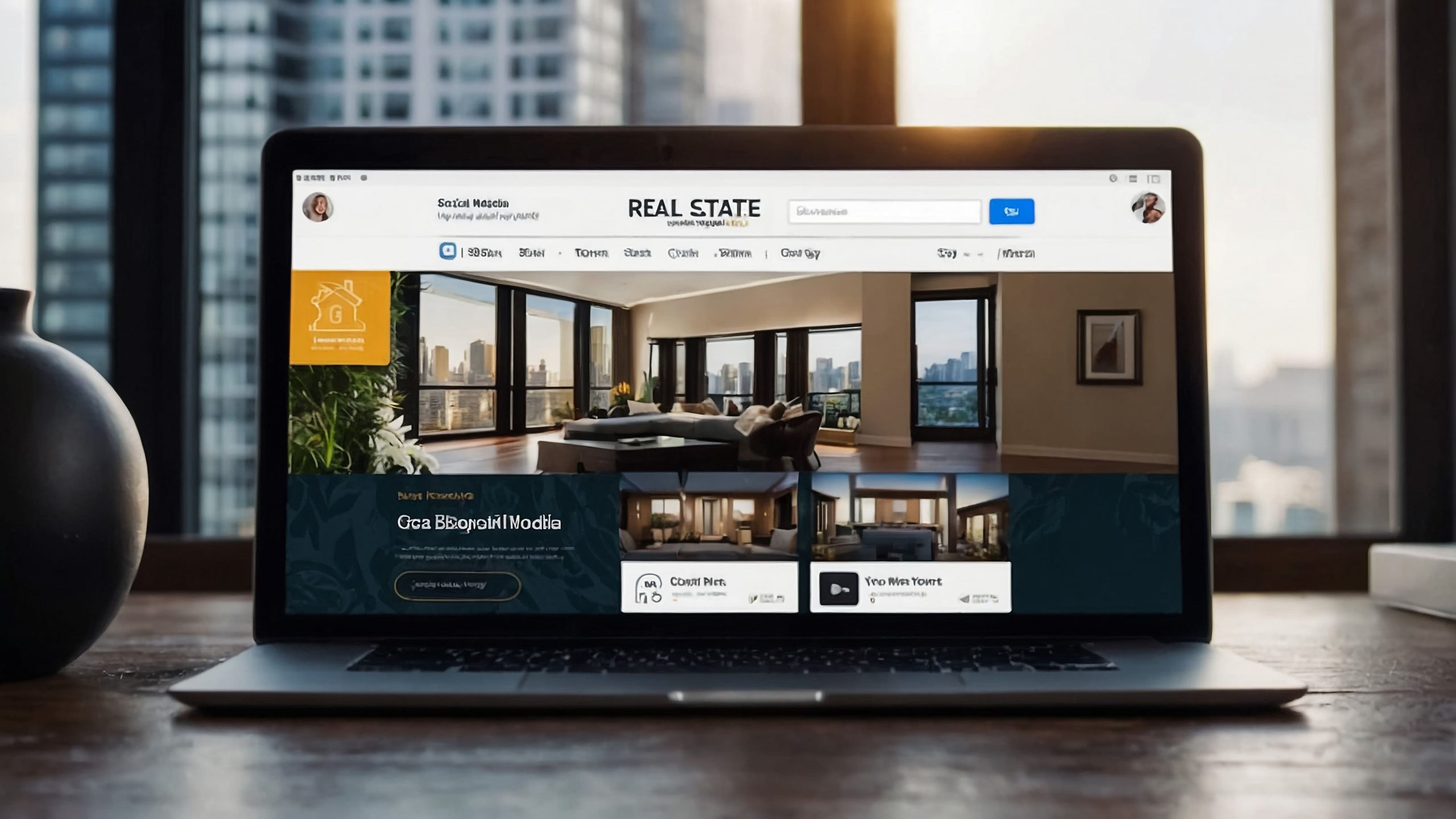
3. Mobile-First Magic: Implement a Mobile-Friendly Design
A mobile-optimized design is essential as mobile devices account for more than 60.4% of all web traffic. A responsive real estate website design ensures that your site looks amazing and works seamlessly on smartphones and tablets.
Example: Redfin’s mobile interface is a prime example, offering a smooth and intuitive experience for on-the-go users.
4. Search Savvy: Integrate Advanced Search Features
Advanced search options, such as price, location, and property type filters, assist users in finding exactly what they are looking for, improving the overall experience. It is a must-have component for any modern real estate website design.
Example: Look to Trulia, which offers detailed search options that allow users to find their dream home with ease.
5. See It Before You Buy It: Offer Virtual Tours
Virtual tours enable prospective buyers to view properties from the comfort of their own homes. This integrated experience is a game changer for real estate website design, adding an extra degree of ease.
Example: Matterport offers stunning 3D virtual tours that let buyers “walk through” a home before stepping foot inside.
6. Fast and Furious: Optimize for Speed
A slow website can turn away potential customers before they ever see your listings. Optimizing your website’s load speed is critical for retaining visitors and increasing your Google ranking. A great real estate website design relies heavily on speed.
Example: The Movoto website is a great example of speed optimization, providing a lightning-fast browsing experience.
7. Call Me Maybe: Use Clear Calls-to-Action (CTAs)
CTAs encourage your visitors to do specific actions, such as signing up for alerts or contacting you. The most effective CTAs are strategically placed, clear, and persuasive, influencing user behavior and increasing conversions.
Example: On Compass.com, well-placed CTAs encourage visitors to contact agents or schedule a viewing with just a few clicks.
8. Trust Builders: Incorporate Client Testimonials and Reviews
Nothing builds trust like social proof. By displaying customer testimonials and reviews, your real estate website design establishes credibility and builds trust, which can have a big impact on buyer decisions.
Example: Take a cue from Coldwell Banker, where they feature testimonials that highlight satisfied clients’ experiences, building confidence in new visitors.
9. Info-Rich: Provide Detailed Property Information
Potential clients want all the information at their fingertips. From space footage to school districts, make sure your property ads include detailed information that answers every inquiry. A detail-rich real estate website design increases user happiness.
Example: Century 21 excels in providing thorough property descriptions, including community details, nearby amenities, and high-quality photos.
10. Get in Touch: Ensure Easy Contact Options
Make it easy for visitors to reach out to you. If you use a contact form, phone number, or live chat, make sure your contact information is easy to find. A great real estate website design contains easy-to-use contact forms that remove friction.
Example: On Sotheby’s International Realty, the “Contact Us” button is prominently displayed on every page, making it easy for visitors to connect with agents instantly.
Conclusion: Transform Your Real Estate Website into a Client Magnet
Finally that you’ve discovered these 10 game-changing real estate website design hacks, it’s time to put them into action. From improving navigation to displaying spectacular visuals, these tactics will transform your website into an appealing destination that attracts customers and converts leads into permanent homeowners.
Let’s Build Your Real Estate Dream Website Together!
Is your real estate website ready to shine? Let Everest Online Marketing create an amazing; high-converting, mobile-friendly site that distinguishes you from the competition. With our experienced web development and design services, you’ll get more leads and close more sales. Contact us immediately to make your concept a reality!




Leave A Comment
You must be logged in to post a comment.