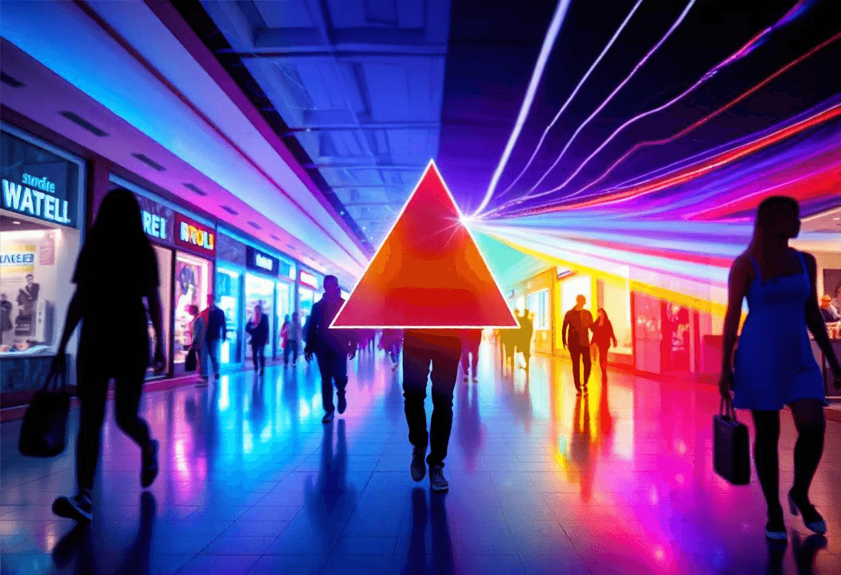
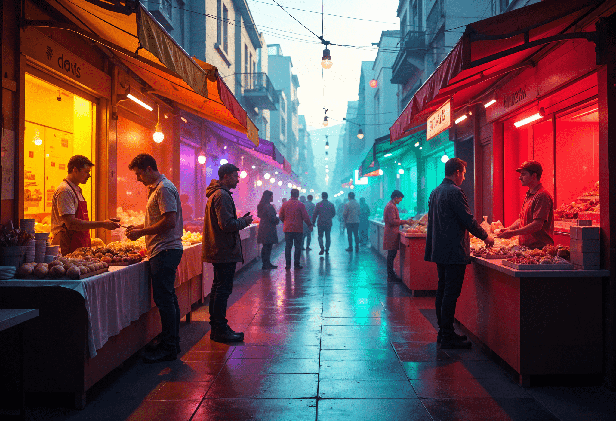
There are moments when you don’t even realize something is speaking to you. Like when you’re walking down a busy street, passing trendy boutiques, scrolling through your feed, or catching an ad between videos. Everywhere you go, colors are quietly communicating with you.
What about that big red “SALE” sign? It creates a sense of urgency. A sleek black box for a fancy gadget? Pure sophistication. And what about the gentle, pastel tones of a wellness brand’s logo? Instantly soothing. Unless you realize it or not, colors are continually influencing your ideas, emotions, and behaviors. It’s not a coincidence—it’s the psychology of colors in business, a subtle but powerful tool that influences how we shop and interact with brands.
In a world where businesses compete for attention, knowing how colors influence customer behavior is like having a secret weapon. From increasing awareness to affecting moods, the colors you choose can create or break your brand’s image. But what lies behind these seemingly basic decisions? Let us explore the intriguing world of the psychology of colors in business and how it plays an unseen but critical part in company success.
Color’s Secret Language: How It Speaks to Your Mind
Color has a subtle influence on your thoughts and emotions wherever you go. Colors speak a language you may not be aware of as you stroll past eye-catching businesses, go through your social stream, or watch a fast advertisement. They influence how you feel, what you think, and even the decisions you make—all without saying anything.
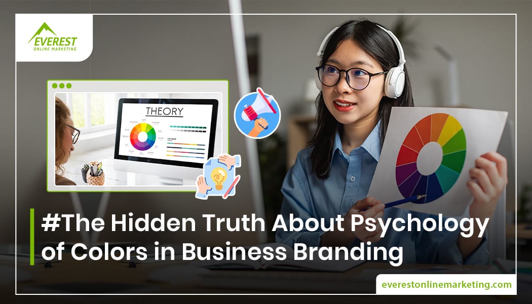
What is the Psychology of Colors in Business and Why Should You Care?
The psychology of colors in business is fundamentally concerned with how different colors influence human emotions and behaviors. In marketing and branding, it is the process of purposefully employing colors to elicit specific feelings and behaviors from customers.
It may be the soothing blue of a financial institution’s logo or the fun yellow of a children’s brand, color sets the tone for the brand’s message before a single word is spoken. This quiet communicator gets into our minds and influences how we see a product or service.
Businesses have long recognized the significance of colors in establishing first impressions. According to a study, individuals make decisions about things in as little as 90 seconds, with color accounting for up to 90% of those decisions. That demonstrates the true impact of the psychology of colors in business.
From Ancient Markets to Modern Malls: A Brief History
The association between color and business branding is not new. Merchants in ancient civilizations employed color in their merchandise and marketplaces to express quality or exclusivity. Fast forward to the twentieth century, and we see some of the first applications of the psychology of color in advertising, as firms began to recognize the emotional pull of color. With the advent of modern marketing, firms have polished their approach to employing color, allowing them to engage more profoundly with their target customers.
Today, the psychology of colors in business is a science-based strategy that combines creativity and consumer psychology.
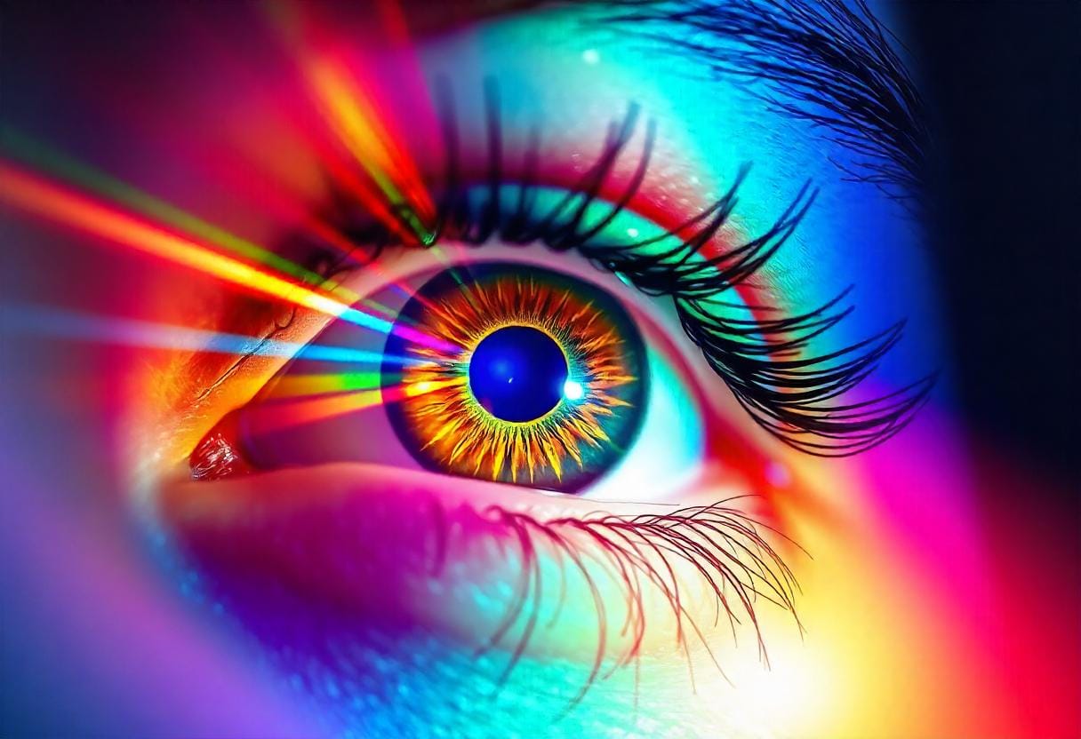
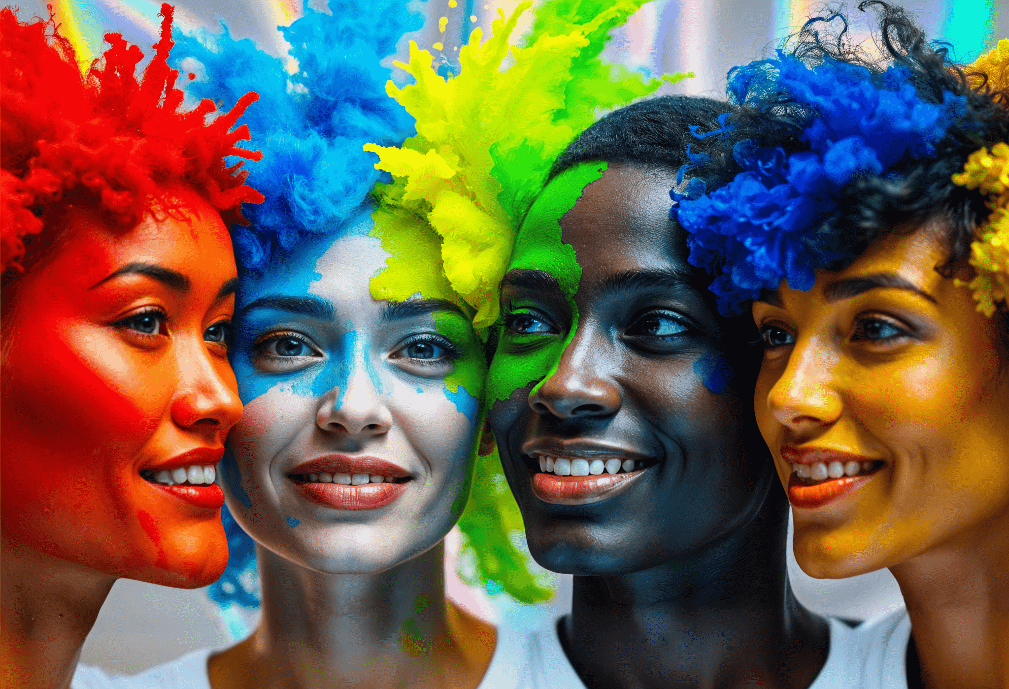
Why Blue Calms and Red Excites: The Science of Color Perception
Colors influence not only how things appear, but also how we feel and respond. In the psychology of colors in business, different hues cause distinct emotional and physiological responses. Here are some notable examples:
Red
Known to increase heart rates and create a sense of urgency, red is commonly used in clearance sales and fast-food brands like McDonald’s and KFC. It’s also associated with passion and energy, making it a bold choice for brands aiming to create excitement.
Blue
Blue is a popular color among internet titans such as Facebook and Twitter, as it is often associated with trust, tranquility, and stability. It is also commonly used in finance, with companies such as PayPal and American Express using blue to represent security and dependability.
Yellow
Bright and cheerful, yellow evokes warmth and happiness. Brands like IKEA and McDonald’s use it to create an inviting, friendly atmosphere that encourages positivity and energy. However, too much yellow can cause anxiety, so it’s often used in moderation.
Green
Green is a popular color for eco-friendly firms and wellness organizations such as Whole Foods, as it is associated with health, nature, and balance. It is also featured in financial institutions such as TD Bank, where it represents progress, wealth, and security.
Orange
A mix of red’s energy and yellow’s cheerfulness, orange promotes enthusiasm and creativity. It’s often used by brands like Nickelodeon and Fanta to convey fun and playfulness. In marketing, orange can stimulate action, making it useful for calls to action and subscription buttons.
Purple
Purple is historically associated with royalty, elegance, and wisdom, and it oozes refinement. Cadbury and Hallmark use purple to symbolize quality and beauty. It’s also a popular color for beauty and anti-aging goods because it represents innovation and mystery.
Black
Symbolizing power, elegance, and modernity, black is often used for high-end brands like Chanel and Mercedes-Benz. Its sleek and sophisticated feel adds a sense of exclusivity, making it a popular choice in luxury branding.
Pink
Pink is often linked with femininity, nurturing, and compassion, and it is widely utilized in businesses that cater to women, such as cosmetics, fashion, and childcare. Pink is used by brands such as Victoria’s Secret and Barbie to portray feelings of warmth, care, and compassion.
Brown
Earthy and grounded, brown conveys reliability and comfort. It’s frequently used in industries tied to nature and craftsmanship, such as food and beverage brands like Hershey’s and organic products.
White
White, which represents purity, cleanliness, and simplicity, is often employed in the health and wellness industries, as well as modern tech businesses such as Apple. It generates a sense of space and clarity, which can make designs appear more open and approachable.
The hidden truth behind these responses is that colors excite various sections of our brain, changing our perceptions and behaviors before we are aware of them. Understanding the psychology of colors in business allows brands to actively create experiences that appeal to their target audience’s emotions and influence decisions.
The Hidden Truth About the Psychology of Colors in Business Branding
So, what are the secrets behind color choices in branding? Let’s swirl into the top 10 hidden truths of the psychology of colors in business that every business owner and designer should know:
1. Color Isn’t Just About Looks—It’s About Perception
Color isn’t just an aesthetic choice. It has an immense impact on how customers view your brand, influencing its identity and messaging.
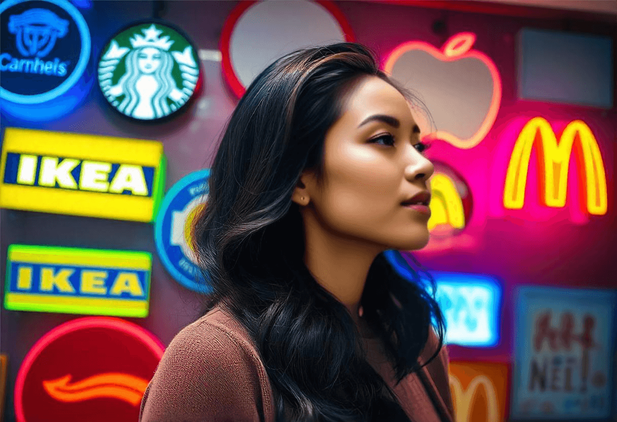
For example, Apple’s sleek black-and-white color scheme emphasizes simplicity, refinement, and modern technology. Coca-Cola, on the other hand, picked red to represent enthusiasm, passion, and energy, leaving customers feeling motivated when they interact with their products.
Essentially, the appropriate color palette can influence how your brand is perceived as elegant, playful, professional, or innovative.
2. Cultural Differences Matter
Color meanings can differ dramatically among cultures, which is important for global brands to consider.
White represents purity and new beginnings in Western societies, yet it is frequently associated with sadness and death in many Eastern traditions, particularly in China and India. Similarly, while red may represent good fortune and prosperity in nations such as China, it may also indicate danger or warning in the West.
In the psychology of colors in business, understanding these cultural nuances ensures that your brand’s colors resonate positively with your target audience across multiple areas, rather than generating misunderstanding or offense.
3. The First Impression Is 90% Color-Based
According to the psychology of colors in business studies, up to 90% of consumers make fast judgments about things based just on color. This means that the color scheme of your brand has a significant impact on the first impression it makes.
Customers may not even look at your logo or product packaging if it does not immediately attract their attention or generate the correct feeling.
Choosing the proper color allows you to immediately communicate your brand’s personality and values.
4. Color Builds Brand Recognition
Consistency in color usage dramatically boosts brand recognition. According to research, color increases brand recognition by up to 80%.
A prime example is Tiffany & Co.’s distinctive robin-egg blue. The company’s signature color has come to represent luxury, elegance, and exclusivity. When someone sees that hue, they immediately think of Tiffany & Co.,
This demonstrates that judicious color use can become one of your brand’s most significant assets.
5. Gender Preferences Play a Role
Studies reveal that men and women frequently react to color in different ways. Men favor dramatic, cooler colors like blue, black, and gray, whereas women choose softer, warmer tones like purple, pink, and green. This data can help brands that target to a specific gender fine-tune their color choices.
For example, Harley-Davidson appeals to a largely male audience by using dark, manly colors such as black and orange. Likewise, beauty businesses frequently employ milder shades to appeal to feminine clients.
6. Simplicity Wins in Brand Colors
In terms of brand colors, less is more. In the psychology of colors in business, too many colors might overwhelm customers, diluting your brand’s personality and making it more difficult to remember.
Leading firms such as Nike and Google keep their color palettes basic, resulting in instantly recognizable logos. Nike utilizes a single, strong black or white to represent boldness and strength, but Google’s four-color logo—simple yet distinct. It makes the brand appear lively, diverse, and approachable.
7. Different Shades, Different Messages
Even within the same hue family, differing tints can transmit very distinct messages.
For example, dark blue is frequently linked with professionalism, authority, and trust, which is why firms such as IBM and Ford employ it in their branding. In contrast, light blue expresses tranquility and approachability, making it a popular option for companies such as Twitter and Skype.
Understanding the consequences of the psychological of colors in business with different hues enables you to create a more precise and compelling brand message.
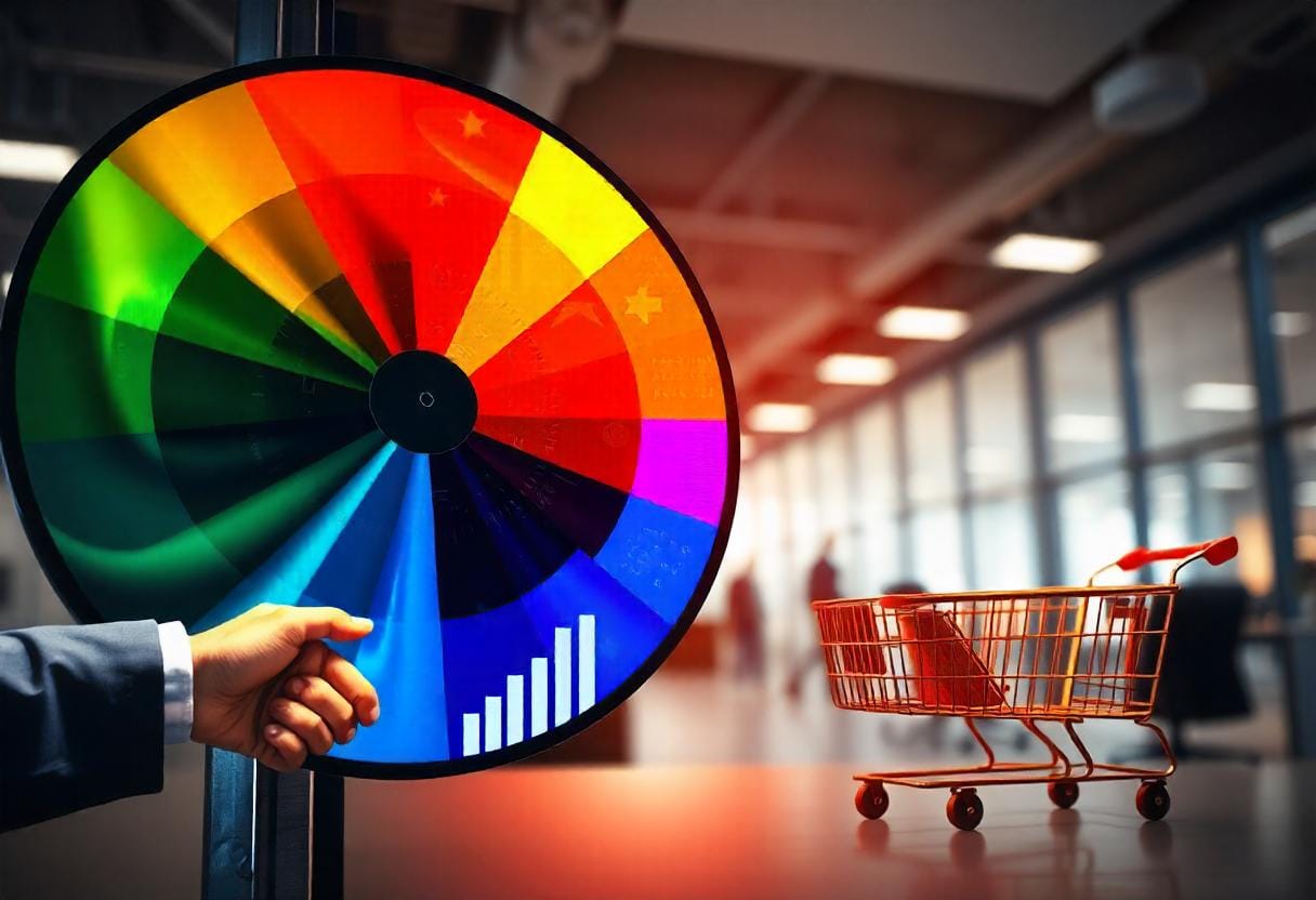
8. Color Can Trigger Impulse Buys
Certain hues, particularly red and yellow, have been shown to drive spontaneous purchases.
Fast-food restaurants such as McDonald’s, Burger King, and Pizza Hut employ red and yellow in their logos and interior designs because these colors are believed to raise heart rate, stimulate appetite, and generate a sense of hurry.
This aspect of the psychology of colors in business might encourage customers to make faster purchasing decisions.
9. Consistency Across All Channels Is Crucial
A brand’s color scheme should be consistent across all touchpoints, including the website, social media, product packaging, and advertising. Inconsistencies can mislead customers and undermine brand identity.
Assume a corporation uses one set of colors on its website and an entirely different set on its social media. This not only appears unprofessional, but it also breaks the emotional connection that buyers form with the business.
Consistency builds trust, making it easier for customers to identify and engage with your brand.
10. Emotional Connections Create Loyalty
Colors have a unique potential to stir up emotions, and when buyers develop an emotional attachment to a brand’s color scheme, they are more likely to remain loyal.
Starbucks is a good example; its green logo represents more than simply coffee. Green represents peace, growth, and sustainability, all of which are consistent with Starbucks’ brand values of community, environmental responsibility, and personal comfort.
This psychology of colors in business showcases that emotional connection keeps customers returning, making them feel at ease when they see the familiar green symbol.
The Final Stroke: How Your Brand’s Colors Speak Louder Than Words
Color is more than simply decoration; it is a potent branding tool that can convey a lot about your company before you even say anything. The psychology of colors in business helps brands make meaningful connections, transmit emotions, and stand out in a crowded industry. You can boost your brand’s identity and achieve long-term success by carefully selecting and implementing colors that resonate with your intended demographic.
Enhance Your Brand’s Color Palette with Everest Online Marketing
Ready to give your brand the color makeover it deserves? Everest Online Marketing offers expert graphic design services that harness the power of the psychology of colors in business. Let us help you in creating a visually appealing brand that not only captures the eye but also connects with your target audience on a deeper, emotional level. Contact us today to start crafting your brand’s perfect palette!
Leave A Comment
You must be logged in to post a comment.