
Graphic design is the first thing you see when you are browsing in an online shop, what are the primary factors you are looking for in a product? According to SmallBizTrends with their recent survey, more often than not, color is the reason why consumers buy a product. Statistics showed that 93% of buyers focus on visual appearance and 85% of them claimed that color is at top of their list of concerns. Thus, in talks of graphic design and marketing, designers and marketers try to work together to make the most out of the benefits of these different colors. But what’s with the color green and why does it seem to be more impactful?
Green’s Significance in Graphic Design
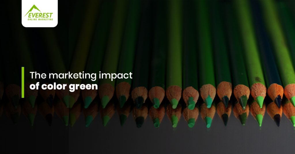
What’s the first thing that comes to your mind when you think of the color green?
Most probably, you’ll think about nature, trees, leaves, mountains, and almost all of the living things that surround us. Well, those are the reason’s why this specific color also incorporates growth, life, renewal, health, abundance, peace, security, and refreshment. According to psychologists, green encourages balance in your brain which makes you calm and leads to decisiveness.
Resulting of the combination of two primary colors, yellow and blue, the different shades of green can also give off a variety of emotions. If yellow shows joy and youth, while blue makes you feel secure and peaceful, green has a lot more to offer. The lighter shade of green for example can bring you to the first day of spring, about the young leaves sprouting on the trees. In short, freshness and life. Meanwhile, the darker shade of green corresponds to a more deep feeling of stability and growth, which can be compared to the sturdiness of the colors of the mountains and the mature leaves of a full-grown tree. With this, you can safely say that you can never go wrong with green if you will be using it for your brand.
Green as a Brand Color
For sure, you know that there are already thousands of famous brands who were able to use green in their favor. Starbucks, Android, XBOX, GoDaddy, Spotify, 7Eleven, Tropicana, and Monster are only a few of the most popular brands all over the world that uses green as their brand color.
However, another thing in graphic design is that aside from choosing your main brand color, you also have to think of the other complementary colors and palettes that you will use to send your brand message effectively. Take note of the following:
- Green texts on a green background can be a bit hard to read.
- Very light shades of green like neon can be really irritating to the eyes.
- If you will add green with other colors such as red can automatically make people remember the holidays.
- Most brands use green on their call-to-action buttons. Simply because green is also known for representing the “go” signal in the traffic lights.
A graphic designer must only be knowledgeable about these things. However, as a brand owner or a marketer, it is also important that you get a bit of understanding about the psychology of colors and the specific color you are currently using or you will be using for your brand.
Everest Graphic Design Services
Everest Online Marketing values the psychology of colors used in their every design. We provide our clients with meaningful and effective designs to help them create a brand identity, increase their online presence, and achieved their business goals. We make sure that we do not just design but create designs that will help your business reach its full potential. Contact us today.
Leave A Comment
You must be logged in to post a comment.